Wednesday 10 December 2014

Audience Profile


The audience profile for the final product will be male 16-25 year olds (as illustrated by the mindmap above) By emphasising the artists image through representation generated by the topic of the article, the style of the included images and the layout and colour scheme of the article, my final product will be successful in addressing and appealing to the target audience. In order to broaden the the appeal to a slightly wider audience, stereotypical objectification of females will not be present within the product. This will allow the product to also be more effective in appealing to female listeners, which as shown by the graph below make up the majority of listeners to Hip Hop/Rap.

My product will be presented in a way which has the objective of targeting Hip Hop listeners, these listeners will fall into a specific demographic. By adhering to other interests commonly held by members of this demographic I can maximise the appeal to the focus demographic.


This graph reveals that despite stereotypical gender representations present within Hip Hop and related forms of media, females make up over 50% of listeners. In order to appeal to these listeners I will not follow the conventional representations of gender and wealth within my final product.


Within the adult demographic the two age ranges comprising the 18-34 group make the majority of hip hop listeners, comprising over 50% of listeners. In order to appeal to this demographic I will represent the artists within the magazine in a manner which takes influence from those of the late 90's and early 2000's, in order to create an image which this demographic will likely be able to identify with this style of representation as it adheres to conventions within an older variant of the genre which the focus audience will be more familiar with.


Below is a reader profile for XXL magazine. The reader profile does not directly correlate with the information on Hip Hop listeners given in the graphs above. This is most noticeably evident in the gender being 78% male within readers of XXL, compared to males making up less than 50% of Hip Hop listeners. This may be due to frequent objectification of female artists paired with stereotypical gender based representations within XXL.


Sunday 9 November 2014

Music Photographer Research: Jonathan Mannion

Jonathan Mannion photographs Hip Hop artists in environments which reflect the lifestyle of the artist when not performing or recording. By capturing the artists at moments which the audience may not be aware of, the image conveys information to the viewer about the artists life, perhaps giving their music more depth to the audience.

By capturing the subjects with a wide shot their environment in included within the frame, putting the artist into context and thus revealing more information about them to the viewer. In Mannion's work, the background is almost as important as the subject as it conveys to the audience the artists lifestyle and creates a much more personal tone aided by the indirect mode of
address. I will employ similar techniques in my
photography in order to represent my artists in
a manner which generates a similar effect.

Wednesday 5 November 2014

Music Photographer Research: Cognito


 Cognito's photography is often monochromatic, placing emphasis on the artists posture, costume and paralanguage, as well as creating a darker mood. Cognito's work takes on an eerily atmospheric aesthetic which would likely appeal to a subversive audience when featured in a music magazine. Two of the artists which the photographer frequently associates with, and whom are featured in this post, are MF DOOM and Mos Def. These artists both produce music which diverges from the more commonly encountered mainstream Hip Hop, appealing to an audience which may focus their attention on


 underground production. I feel that Cognito's imagery effectively conveys a visual representation of this to his viewers, a technique I would like to include in my final piece to create a more subversive representation of my artist.

In order to achieve a similar effect to his work, I will include similar elements within my photography such as low key lighting and a shallow depth of field in order to remove the background and place emphasis on the artist. These two elements are key in creating the semi - silhouetted effect which is signature of his work and effective in creating the desired effect.  


Monday 3 November 2014

Generic Gender Representation in Hip Hop Magazines

Genders are represented within Hip Hop magazines in a very stereotypical way. Objectification of women is extremely common on the covers of many mainstream examples of professional magazines. By adding a sexual element to the cover of a magazine the target audience of young males are likely to be more inclined to buy it, as their expectations of perceived social norms are being followed by both genders being represented as each having their own respective roles. By gratifying the focus audiences expectations the magazine is more likely to sell. This also includes representing men in a stereotypically dominant and masculine way.
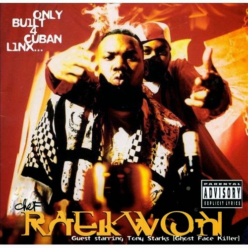
These representations are often conveyed through camerawork, costume and the artists paralanguage. For example men are often shot with a medium close up or close up shot, generally emphasising facial expression or posture. Women on the other hand are conventionally shot using a medium or even a full body shot, in order to capture and emphasise her whole body as opposed to facial expression. Costumes are also distinctly masculine or feminine, men are often photographed in suits, or causal street wear that covers most of the artists body such as hoodies or jackets. Women are often shot wearing much more revealing costume in order to convey sex appeal to the audience.

By employing stereotypical representation of female artists magazines are sacrificing appeal to women for a much greater appeal to men, as shown by their reader profiles where men often make up the vast majority of readers. In order to appeal to a broader audience my product will unconventionally exclude stereotypical representations of female artists.


Sunday 2 November 2014

Title Block Analysis: Cover Page


The colour scheme used in this example is unconventional of the genre. The unorthodox decision by the editor not to use black font challenges set conventions, perhaps leading the reader to perceive the featured artists as underground through a subversive representation. The navy blue colour used in the background is also present in the artists costumes, adding cohesion to the text. The green colour featured in the title block and font links the artists to the magazine representing a link between them, further adding to the cohesion and perhaps leading viewers to purchase the product. 


Colour Scheme Analysis: Two Page Spread


The colour scheme of this two page spread taken from XXL magazine consists of red, black and white with a black and white photograph. This colour scheme is effective in drawing attention to a single feature of the double page spread, as the title is the only featured colour. The absence of bright colours in this example creates a relaxed tone which relates to the featured artist 'growing old gracefully'. This colour scheme would likely appeal to a wider range of audience compared to the example featuring Lupe Fiasco as a more laid-back tone i present in the text.

Colour Scheme Analysis: Two Page Spread


The black, white and gold colour scheme is effective in this example as it draws the viewers attention to the featured artist, as he contrasts the black background. The colour scheme is consistent throughout the spread, even continuing onto the photographed artists costume.  This conveys a strong link between the article and the artist, allowing the viewer to assume that he is the subject without having to read in depth. This particular colour scheme creates a more subversive atmosphere compared to other brighter examples.

Saturday 1 November 2014

Title Blocks: First Drafts

I have begun designing the title block for my final product. These are two possibilities that will likely be altered in the making of my final piece. I feel that the yellow on black colour scheme is more effective but I will fill the text to make it easier to read.

Friday 31 October 2014

Artist representations through album covers

Album artwork during the late 80's through to the early 2000's was distinctly different to modern album covers being released to day. These differences are comparable to that found within Hip Hop magazines mentioned in a previous post (http://morecdc.blogspot.com/2015/03/aesthetic-conventions-of-hip-hop.html?zx=655d8241a4773710). Older album covers have a tendency to carry a more 'gritty' aesthetic quality; commonly featuring asymmetrical and jagged fonts, stronger colours and greater use of low angles/medium shots, featuring a larger proportion of the artists body.

Examples of such are found below:

NWA - 'Straight Outta Compton' cover (1988)


Raekwon - 'Only Built 4 Cuban Linx' (1994)


MF DOOM - 'Mm... Food' (2004)

In order to maximise the appeal of my final product to my target audience, I plan to reflect the style of these covers in my work, in order to represent my featured artists in a similar manner to the niche audiences expectations. 

Aesthetic conventions of Hip Hop magazines

Aesthetic conventions of Hip Hop magazines:


Contemporary Hip Hop magazines tend to feature 'clean' aesthetics. This is generated through a minimalistic page layout and colour scheme, paired with what can be generalised as modern and rectangular fonts when it comes to headlines.


The above example bears the aforementioned features; a simple three-tone (white, red, black) colour scheme, a bold modern headline font and a blank white background. The 'clean' aesthetic quality of the article connotes professionalism, representing the artist in a manner which will most likely gain mass appeal due to the contemporary and somewhat white-collar manner in which the artist is presented to the audience. This representation indirectly suggests wealth and success through the overall appearance of the page, qualities which modern rappers generally associate themselves with through their music. This representation carries on from the target audience’s generic expectations of the artists, thus appealing to the widest range of the focus demographic as possible. 

Wednesday 29 October 2014

Title Block Analysis

Before beginning production of my title block for my magazine cover I have analysed three generic professional examples. I have included evaluative comments and reflected upon how these examples will influence my final title block.

Tuesday 28 October 2014

Props and costume planning

I have begun planning my use of props and costume in my final product as a means of creating an unconventional representation of a Hip Hop artist. This will be achieved through a slightly alternative use of costume and props.
 

Audience Research: Online Survey

As part of my research and preparation for my final task I have conducted an online survey on my target audience (male 16-30 year old). I have analysed and evaluated the results and given planning on how these results will effect my final product.

Monday 27 October 2014

Updated mind map


AJA Feedback


1. Improve analysis – 2 of each (cover, contents, DPS)

2. Ensure all posts have titles

3. Do mindmap using Text2mindmap site and add more detail

4. Move shot plans to before Preliminary Task magazine pages

5. Evaluate focus group responses

6. Add comments for moodboard explaining ideas

7. Add: questionnaire results and evaluation

8. Add research into conventions of other music magazine genres (and move this post to earlier on – see task checklist for correct order)
9. Come up with more of your own tasks to add - see example blogs on OCR Weebly (Kamini blog in particular):


Saturday 25 October 2014

Evaluation of Group Feedback

The feedback I was given from my focus group has been invaluable to my understanding of how to present my final product in a way which will be pleasing to my target audience.

On the topic of the XXL cover featuring Dr. Dre one member stated that the continuation of the colour scheme through to the artists costume proved to be highly effective, representing the artist as having a link with the text and generating an aesthetically pleasing quality.
Another member stated that the use of props to represent the artists music in an indirect manner was effective in portraying the artist in a cognitive fashion.

When speaking about the SOURCE example, someone mentioned that the ninety degree rotation of 'THE' was an effective tweak to the title block, perhaps appealing to a younger and more subversive audience.

When asked to speak about the contents page featuring Ice Cube a member came to the conclusion that the low-key lighting in combination with the close-up tight framing of the artists face effectively created a dominant and aggressive representation of the artist. The semi translucent effect on the coloured box also received positive feedback, specifically about the aesthetic quality and the simple, easy to navigate layout it generated.
When designing my contents page I will also include a semi translucent coloured block in order to achieve the same aesthetic quality as the example.            

The members of the focus group seemed to agree that the use of the rule of thirds within the double page spread featuring Kat Williams was aesthetically pleasing adding cohesion to the spread and making it easy to navigate. The also said that the colour scheme donated to this. One student mentioned that the size of the font was too small and should be made larger for easier accessibility. It was also agreed that by including controversial content within the article, the audience would feel more drawn towards it and engaged.
My final article will also include a similar topic to this example in order to achieve the same effect and appeal to the audience through a topic they find interesting allowing for maximum accessibility.

Audience research: Group Feedback

In preparation for my final product I have begun audience research. In this example I have taken a group of peers who fall into the target audience for my magazine and asked for their feedback on professional examples of other magazines within the genre.
media hw from miles orec on Vimeo.

Moodboard

As part of planning for my final product I have created a mood board in order to help to create and direct a cohesive and unifying tone for my final product. I feel that these images effectively interpret the urban street culture present in many representations of Hip Hop. They work together to provide a rough visual representation of how my final product may appear.

Monday 20 October 2014

Illustration Research + Analysis

This two page spread incorporates a series of illustrations as opposed to photographs. This is an effective way to represent the artist as it directly defies conventions of the genre. This indirectly conveys to the audience that the featured artist (Ill Bill) produces music in a fashion that similarly defies generic conventions. However, the way in which the magazine is laid out according to the rule of thirds, colour scheme and content is all conventional of Hip Hop magazines, and effectively creates an aesthetically pleasing effect. This builds on the representation of the artist to suggest to the audience that although his music may defy conventions, it is still of a high calibre.
I plan to incorporate something of this style into my final product in order to effectively create a similar representation, although I may not go as far as this example.   

Saturday 18 October 2014

Planning: Generic Conventions Mindmap

As part of preparation for my task to make a music magazine I have studied the conventions of the genre which I plan to emulate.

Research: Examples of Professional Magazines

In preparation for my coursework I have analysed several different magazine covers, two page spreads and contents pages that fall within the same genre. By understanding the conventions of the genre I will be able to make a more effective magazine by following these conventions.

Wednesday 8 October 2014

AJA Feedback

1. Textual analysis is too brief. Aim for more detail when you analyse similar products for the main task.  
2. Post your shot plans
2. Evaluate your prelim task, discussing strengths and weaknesses. Also discuss what you have learnt that will make you do things differently in the main task
5. Post regular progress reports on your blog – treat it like a diary 

6. Try to come up with more of your own planning/research tasks to show your own creative journey

More effort required Miles. 

Thursday 25 September 2014

Preliminary Task Final Product

preliminary school magazine task

Cover:


Contents page:


Contents page influence:

Tuesday 23 September 2014

Preliminary Task Shot Plans


Preliminary school magazine photo planning:

These are my initial shot plans for the cover and contents page of the preliminary task.


Sunday 14 September 2014

Media studies unit G321 print

university magazine analysis